Skip to content
Free Excel Tutorials
  • Home
  • Excel For Beginners
  • Excel Intermediate
  • Advanced Excel For Experts

Data Analysis

  • How To Create Frequency Distribution in Excel
  • Data Series in Excel
  • Randomize/ Shuffle List in Excel
  • Reverse List in Excel
  • Conditional Formatting Rules in Excel

References

  • Convert text string to valid reference in Excel using Indirect function
  • Lookup entire row in Excel
  • Last row number in range
  • Find closest match in Excel
  • MATCH function: Description, Usage, Syntax, Examples and Explanation

Data Validations

  • Excel Data validation no punctuation
  • Prevent invalid data entering in specific cells
  • Excel Data validation must begin with
  • Excel Data validation must contain specific text
  • Excel Data validation don’t exceed total

Category: Data Analysis

Excel Data Analysis is a powerful tool that is used to visualize and gain insights of records in a spreadsheet.

Number and Text Filters Examples in Excel

by

How to apply a number filter and a text filter to only display records that meet certain criteria. Follow the steps below: 1. Click any single cell inside a data set. 2. On the Data tab, in the Sort & Filter group, click Filter. Arrows in the column headers appear. Number Filter To apply a number filter, execute the …

Continue Reading

How to Create Gantt Chart in Excel

by

Illustrate Project Schedule in Gantt Chart Excel does not offer Gantt as chart type, but it’s easy to create a Gantt chart by customizing the stacked bar chart type. Below you can find our Gantt chart data. To create a Gantt chart, execute the following steps. 1. Select the range A3:C11. 2. On the Insert tab, in the Charts …

Continue Reading

Randomize/ Shuffle List in Excel

by

How to randomize / shuffle a list in Excel. For example, we want to randomize the list in column A below. 1. Select cell B1 and insert the RAND() function. 2. Click on the lower right corner of cell B1 and drag it down to cell B8. 3. Click any number in the list in column B. 4. To …

Continue Reading

Reverse List in Excel

by

This chapter teaches you an easy way to reverse a list in Excel. For example, we want to reverse the list in column A below. 1. Enter the value 1 into cell B1 and the value 2 into cell B2. 2. Select the range B1:B2, click the lower right corner of this range, and drag it down to cell B8. 3. …

Continue Reading

Use Data Form to input, edit and delete records in Excel

by

The data form in Excel allows you to add, edit and delete records (rows) and display only those records that meet certain criteria. Especially when you have wide rows and you want to avoid repeated scrolling to the right and left, the data form can be useful. 1. Open the downloadable Excel file. 2. Add the Form command to the …

Continue Reading

Conditional Formatting New Rule with Formulas in Excel

by

If the Highlight Cells Rules, Top/Bottom Rules, Data Bars, Color Scales and Icon Sets are not sufficient, you can create a new rule. For example, highlight the codes below that occur more than once in the range A2:A10 andhave a score greater than 100. 1. Select the range A2:A10. 2. On the Home tab, in the Styles …

Continue Reading

How to Sort by Color in Excel

by

Sorting data is an integral part of data analysis. You might want to arrange a list of names in alphabetical order, compile a list of product inventory levels from highest to lowest, or order rows by colors or icons. This example teaches you how to sort data by color in Excel. 1. Click any single cell inside a data set. 2. …

Continue Reading

Add Outline to Data in Excel

by

Outlining data makes your data easier to view. In this example we will total rows of related data and collapse a group of columns. 1. First, sort the data on the Company column. 2. On the Data tab, in the Outline group, click Subtotal. 3. Select the Company column, the column we use to outline our worksheet. 4. Use …

Continue Reading

Subtotal function in Excel

by

The SUBTOTAL function ignores any rows that are not included in the result of a filter, no matter which function_num value you use. The SUBTOTAL function is designed for columns of data, or vertical ranges. Use the SUBTOTAL function in Excel instead of SUM, COUNT, MAX, etc. to ignore rows hidden by a filter or manually hidden rows. Rows …

Continue Reading

Filter Data Based on Date in Excel

by

This example teaches you how to apply a date filter to only display records that meet certain criteria. 1. Click any single cell inside a data set. 2. On the Data tab, in the Sort & Filter group, click Filter. Arrows in the column headers appear. 3. Click the arrow next to Date. 4. Click on Select …

Continue Reading

Conflicting Multiple Conditional Formatting Rules in Excel

by

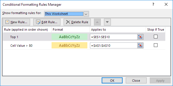
A higher rule always wins when working with  multiple conditional formatting rules in Excel . This example illustrates two different results. 1. The value 95 is higher than 80 but is also the highest value (Top 1). The formats (yellow fill vs green fill and yellow text color vs green text color) conflict. A higher rule always wins. …

Continue Reading

How to create Checklist in Excel

by

This example teaches you how to  insert checkbox to create a checklist in Excel. First, turn on the Developer tab. Next, you can create a checklist. You can also insert a check mark symbol. To create this checklist, execute the following steps. 1. On the Developer tab, in the Controls group, click Insert. 2. Click Check Box in the Form Controls section. 3. …

Continue Reading

Excel Frequency Function Example

by

The FREQUENCY function in Excel calculates how often values occur within the ranges you specify in a bin table. You can also use the COUNTIFS function to create a frequency distribution. 1. First, enter the bin numbers (upper levels) in the range C4:C8. 2. Select the range D4:D9 (extra cell), enter the FREQUENCY function shown below and finish by pressing …

Continue Reading

Excel Bar Chart

by

A bar chart is the horizontal version of a column chart. Use a bar chart if you have large text labels. To create a bar chart, execute the following steps. 1. Select the range A1:B6. 2. On the Insert tab, in the Charts group, click the Column symbol. 3. Click Clustered Bar. Result:  

Continue Reading

How to Create Column Chart in Excel

by

Column charts are used to compare values across categories by using vertical bars. To create a column chart, execute the following steps. 1. Select the range A1:A7, hold down CTRL, and select the range C1:D7. 2. On the Insert tab, in the Charts group, click the Column symbol. 3. Click Clustered Column. Result:   Note: only …

Continue Reading

Conditional Formatting Data bars Examples in Excel

by

Data bars in Excel make it very easy to visualize values in a range of cells. A longer bar represents a higher value. To add data bars, execute the following steps. 1. Select a range. 2. On the Home tab, in the Styles group, click Conditional Formatting. 3. Click Data Bars and click a subtype. Result: Explanation: by …

Continue Reading

Conditional Formatting Color Scales Examples in Excel

by

Color Scales in Excel make it very easy to visualize values in a range of cells. The shade of the color represents the value in the cell. To add a color scale, execute the following steps. 1. Select a range. 2. On the Home tab, in the Styles group, click Conditional Formatting. 3. Click Color Scales and click …

Continue Reading

Conditional Formatting Icon Sets Examples in Excel

by

Icon Sets in Excel make it very easy to visualize values in a range of cells. Each icon represents a range of values. To add an icon set, execute the following steps. 1. Select a range. 2. On the Home tab, in the Styles group, click Conditional Formatting. 3. Click Icon Sets and click a subtype. Result: Explanation: …

Continue Reading

Create Scatter Chart in Excel

by

Use a scatter chart (XY chart) to show scientific XY data. Scatter charts are often used to find out if there’s a relationship between variable X and Y. Straight Lines To create a scatter chart, execute the following steps. 1. Select the range A1:D22. 2. On the Insert tab, in the Charts group, click the Scatter symbol. …

Continue Reading

How to Create Area Chart in Excel

by

An area chart is a line chart with the areas below the lines filled with colors. Use a stacked area chart to display the contribution of each value to a total over time. To create an area chart, execute the following steps. 1. Select the range A1:D7. 2. On the Insert tab, in the Charts group, click …

Continue Reading

How to create Gauge Chart in Excel

by

This chapter illustrates how create a Gauge Chart. A gauge chart (or speedometer chart) combines a Doughnut chart and a Pie chart in a single chart. This is what the spreadsheet looks like.  To create a gauge chart, execute the following steps. 1. Select the range H2:I6. Note: the Donut series has 4 data points and the Pie …

Continue Reading

How To Insert and Customize Sparklines in Excel

by

Sparklines in Excel are graphs that fit in one cell and give you information about the data. Insert Sparklines To insert sparklines, execute the following steps. 1. Select the cells where you want the sparklines to appear. In this example, we select the range G2:G4.   2. On the Insert tab, in the Sparklines group, click Line. 3. …

Continue Reading

How to combine 2 or more chart types in a single chart in Excel

by

Combination Chart: A combination chart is a chart that combines two or more chart types in a single chart. To create a combination chart, execute the following steps. 1. Select the range A1:C13. 2. On the Insert tab, in the Charts group, click the Combo symbol. 3. Click Create Custom Combo Chart. The Insert Chart dialog box …

Continue Reading

How to Create Thermometer Chart in Excel

by

Thermometer chart shows you how much of a goal has been achieved. This example teaches you how to create a thermometer chart in Excel. Working with sales record in the table below; To create a thermometer chart, execute the following steps. 1. Select cell B16. Note: adjacent cells should be empty. 2. On the Insert tab, in the …

Continue Reading

Everything about Charts in Excel

by

Learn all about how to Create a Chart, Change Chart Type, Switch Row/Column , Legend Position and  Data Labels A simple chart helps to understand voluminous data in Excel than a sheet full of numbers. Create a Chart To create a line chart, execute the following steps. 1. Select the range A1:D7. 2. On the Insert tab, in the Charts group, …

Continue Reading

How to add Trendline to a chart in Excel

by

The essence of adding a trendline to chart  is to show visual data trends. This example teaches you how to add a trendline to a chart in Excel. 1. Select the chart. 2. Click the + button on the right side of the chart, click the arrow next to Trendline and then click More Options.  The Format Trendline pane appears. …

Continue Reading

Chart Axes in Excel

by

Axis Type Axis Titles Axis Scale Most chart types have two axes: a horizontal axis (or x-axis) and a vertical axis (or y-axis). This example teaches you how to change the axis type, add axis titles and how to change the scale of the vertical axis. To create a column chart, execute the following steps. 1. Select the range A1:B7. …

Continue Reading

Data Series in Excel

by

Select Data Source Switch Row/Column Add, Edit, Remove and Move A row or column of numbers that are plotted in a chart is called a data series. You can plot one or more data series in a chart. To create a column chart, execute the following steps. 1. Select the range A1:D7. 2. On the Insert …

Continue Reading

Error Bars in Excel

by

Error bars are graphical representations of the variability of data and used on graphs to indicate the error or uncertainty in a reported measurement. Excel error bars are used to display either the standard deviation, standard error, confidence intervals or the minimum and maximum values in a ranged dataset. To visualise this information, Error Bars …

Continue Reading

Move chart to a separate worksheet in Excel

by

So far we have only seen charts on the same worksheet as the source data (embedded charts). However, you can also move a chart to a separate sheet that only contains a chart (chart sheet). To move a chart to a chart sheet, execute the following steps. 1. Select the chart. 2. On the Design tab, in …

Continue Reading

How To Create Pareto Chart in Excel

by

This chapter teaches you how to create a Pareto Chart in Excel. The Pareto principle states that, for many events, roughly 80% of the effects come from 20% of the causes. In this example, we will see that roughly 80% of the complaints come from 20% of the complaint types. To create a Pareto chart in Excel 2016, execute …

Continue Reading

Remove Duplicates Example in Excel

by

When duplicates are removed in Excel, the first occurrence of the value in the list is kept, but other identical values are deleted. This example teaches you how to remove duplicates in Excel. Go here to only find duplicates. 1. Click any single cell inside the data set. 2. On the Data tab, in the Data Tools group, click …

Continue Reading

Excel Line Chart

by

Line charts are used to display trends over time. Use a line chart if you have text labels, dates or a few numeric labels on the horizontal axis. Use a scatter chart (XY chart) to show scientific XY data. To create a line chart, execute the following steps. 1. Select the range A1:D7. 2. On the Insert tab, in …

Continue Reading

How to calculate correlation coefficient Correlation in Excel

by

Find out how to calculate correlation coefficient between two data arrays in Microsoft Excel through the CORREL function. The correlation coefficient (a value between -1 and +1) tells you how strongly two variables are related to each other. We can use the CORREL function or the Analysis Toolpak add-in in Excel to find the correlation coefficient between two variables. – A correlation coefficient of +1 indicates a …

Continue Reading

Excel Pie Chart

by

Pie charts are used to display the contribution of each value (slice) to a total (pie). Pie charts always use one data series. To create a pie chart of the 2017 data series, execute the following steps. 1. Select the range A1:D2. 2. On the Insert tab, in the Charts group, click the Pie symbol. 3. Click Pie. …

Continue Reading

What-If Analysis: Scenarios and Goal Seek in Excel

by

What-If Analysis in Excel allows you to try out different values (scenarios) for formulas. The following example helps you master what-if analysis quickly and easily. Create Different Scenarios, Scenario Summary and Goal Seek. Navigation: Data Tab → Data Tools Group → What-If Analysis  See Examples below: Assume you own a book store and have 100 books in storage. You sell …

Continue Reading

How To Compare Two Lists in Excel

by

These example describes how to compare two lists using conditional formatting. Example 1: Compare Lists of Customers for May 2010 and April 2010. Select cells in both lists (select first list, then hold CTRL key and then select the second) Go to Conditional Formatting > Highlight Cells Rules > Duplicate Values Press ok. See other examples Example …

Continue Reading

How To Remove Duplicates In Excel Column Or Row?

by

Remove Duplicate Rows Using the Excel Remove Duplicates Command. In Excel, the Remove Duplicates command can help you to remove duplicated records in a column. The Remove Duplicates command is located in the ‘Data Tools’ group, within the Data tab of the Excel ribbon. Follow the steps below: Data Tab → Data Tools Group → Remove Duplicate …

Continue Reading

How To Sort One Column or Multiple Columns in Excel

by

You can sort your Excel data on one column or multiple columns. You can sort in ascending or descending order. Navigation: Data Tab → Sort & Filter Group → Sort One Column To sort on one column, execute the following steps. 1. Click any cell in the column you want to sort. 2. To sort in ascending order, on the Data tab, …

Continue Reading

How To Filter Data in Excel

by

Filter your Excel data if you only want to display records that meet certain criteria. By filtering data in a worksheet, you can find values quickly. You can filter on one or more columns of data. With filtering, you can control not only what you want to see, but what you want to exclude. You can filter …

Continue Reading

Posts navigation

  • 1
  • 2
  • Next

Learn Basic Excel

Ribbon
Workbook
Worksheets
Format Cells
Find & Select
Sort & Filter
Templates
Print
Share
Protect
Keyboard Shortcuts

Categories

  • Charts
  • Data Analysis
  • Data Validation
  • Excel Functions
    • Cube Functions
    • Database Functions
    • Date and Time Functions
    • Engineering Functions
    • Financial Functions
    • Information Functions
    • Logical Functions
    • Lookup and Reference Functions
    • Math and Trig Functions
    • Statistical Functions
    • Text Functions
    • Web Functions
  • Excel VBA
  • Excel Video Tutorials
  • Formatting
  • Grouping
  • Others

Logical Functions

  • IFNA function: Description, Usage, Syntax, Examples and Explanation
  • OR function Examples in Excel
  • How to use Excel NOT Function
  • IF function: Description, Usage, Syntax, Examples and Explanation
  • Nested IF function example in Excel

Date Time

  • Calculate total hours that fall between two times in Excel
  • Find Last Day of the Month in Excel
  • Get days, hours, and minutes between dates in Excel
  • Add workdays no weekends in Excel
  • How to get same date next year or previous year in Excel

Grouping

  • How to randomly assign people to groups in Excel
  • Group times into 3 hour buckets in Excel
  • Group arbitrary text values in Excel
  • Calculate conditional mode with criteria in Excel
  • Group numbers with VLOOKUP in Excel

General

  • Find Most Frequently Occurring Word in Excel Worksheet
  • How to choose page/paper size in Excel before Printing
  • How to Create Calendar in Excel
  • How to get original price from percentage discount in Excel
  • Excel Autofill Cell Ranges, Copy, Paste
© 2025 xlsoffice . All Right Reserved. | Teal Smiles | Abbreviations And Their Meaning