Everything about Charts in Excel
Learn all about how to Create a Chart, Change Chart Type, Switch Row/Column , Legend Position and Data Labels
A simple chart helps to understand voluminous data in Excel than a sheet full of numbers.
Create a Chart
To create a line chart, execute the following steps.
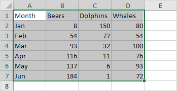
1. Select the range A1:D7.
2. On the Insert tab, in the Charts group, click the Line symbol.
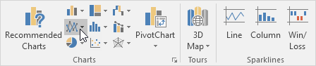
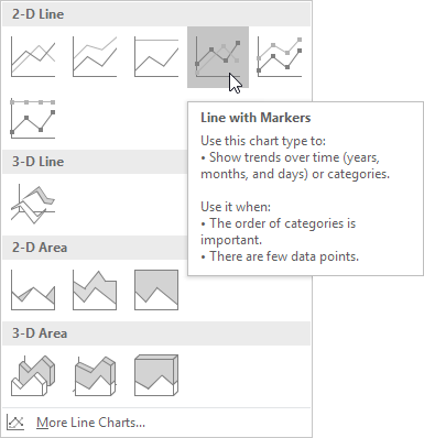
3. Click Line with Markers.
Result:
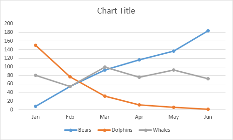
Note: enter a title by clicking on Chart Title. For example, Wildlife Population.
Change Chart Type
You can easily change to a different type of chart at any time.
1. Select the chart.
2. On the Design tab, in the Type group, click Change Chart Type.
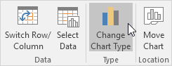
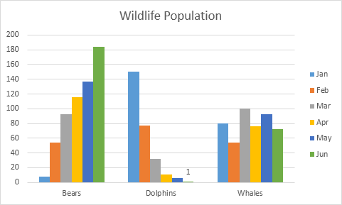
3. On the left side, click Column.
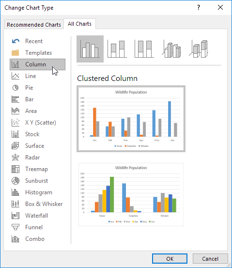
4. Click OK.
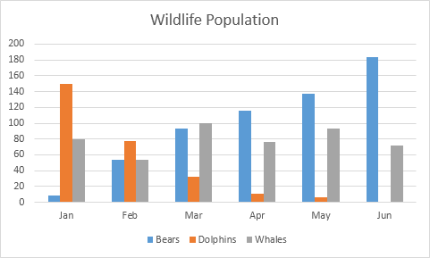
Result:
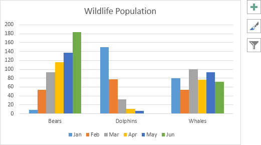
Switch Row/Column
If you want to display the animals (instead of the months) on the horizontal axis, execute the following steps.
1. Select the chart.
2. On the Design tab, in the Data group, click Switch Row/Column.
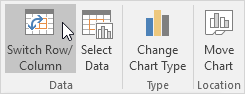
Result:
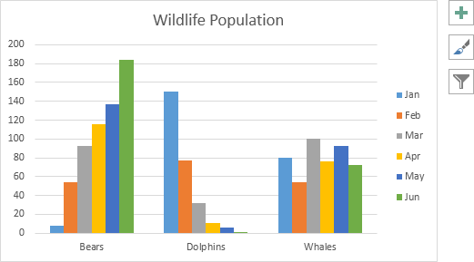
Legend Position
To move the legend to the right side of the chart, execute the following steps.
1. Select the chart.
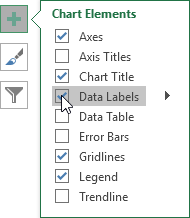
2. Click the + button on the right side of the chart, click the arrow next to Legend and click Right.
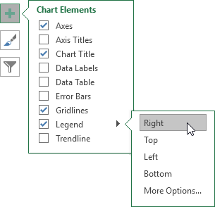
Result:
Data Labels
You can use data labels to focus your readers’ attention on a single data series or data point.
1. Select the chart.
2. Click a green bar to select the Jun data series.
3. Use your arrow keys to select the population of Dolphins in June (tiny green bar).
4. Click the + button on the right side of the chart and click the check box next to Data Labels.
Result: