Chart Axes in Excel
- Axis Type
- Axis Titles
- Axis Scale
Most chart types have two axes: a horizontal axis (or x-axis) and a vertical axis (or y-axis). This example teaches you how to change the axis type, add axis titles and how to change the scale of the vertical axis.
To create a column chart, execute the following steps.
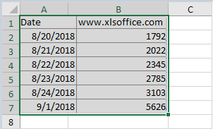
1. Select the range A1:B7.
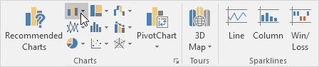
2. On the Insert tab, in the Charts group, click the Column symbol.
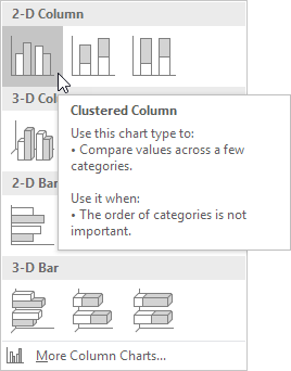
3. Click Clustered Column.
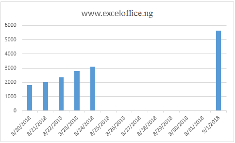
Result:
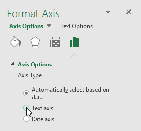
Axis Type
Excel also shows the dates between 8/24/2018 and 9/1/2018. To remove these dates, change the axis type from Date axis to Text axis.
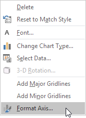
1. Right click the horizontal axis, and then click Format Axis.

The Format Axis pane appears.
2. Click Text axis.
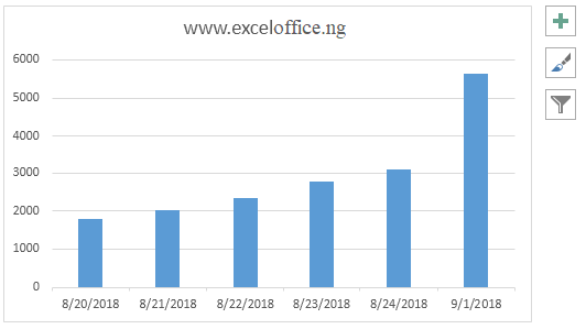
Result:
Axis Titles
To add a vertical axis title, execute the following steps.
1. Select the chart.
2. Click the + button on the right side of the chart, click the arrow next to Axis Titles and then click the check box next to Primary Vertical.
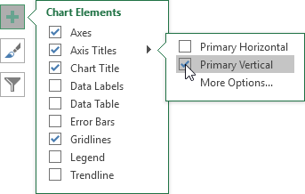
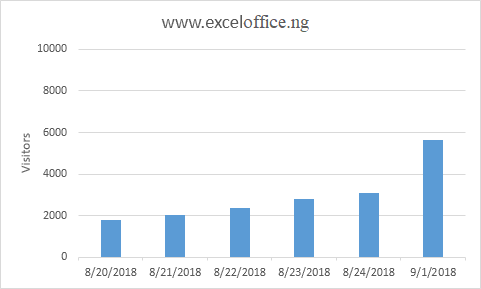
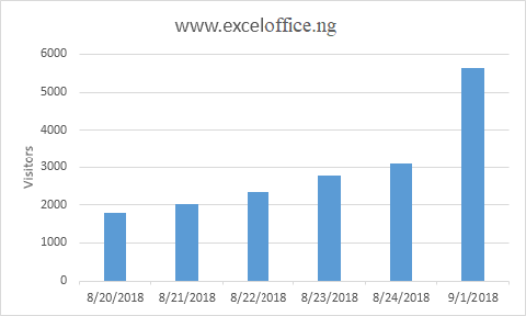
3. Enter a vertical axis title. For example, Visitors.
Result:
Axis Scale
By default, Excel automatically determines the values on the vertical axis. To change these values, execute the following steps.
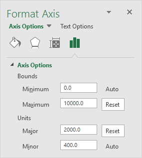
1. Right click the vertical axis, and then click Format Axis.
The Format Axis pane appears.
2. Fix the maximum bound to 10000.
3. Fix the major unit to 2000.
Result: