Skip to content
Free Excel Tutorials
  • Home
  • Excel For Beginners
  • Excel Intermediate
  • Advanced Excel For Experts

Data Analysis

  • Conflicting Multiple Conditional Formatting Rules in Excel
  • How to Use Solver Tool in Excel
  • How to calculate correlation coefficient Correlation in Excel
  • Chart Axes in Excel
  • Number and Text Filters Examples in Excel

References

  • Count rows with at least n matching values
  • Last row number in range
  • How to get last row in text data in Excel
  • How to retrieve first match between two ranges in Excel
  • INDEX function: Description, Usage, Syntax, Examples and Explanation

Data Validations

  • Excel Data validation allow uppercase only
  • Excel Data validation no punctuation
  • Excel Data validation whole percentage only
  • Excel Data validation number multiple 100
  • Excel Data validation require unique number

How to create Gauge Chart in Excel

by

This chapter illustrates how create a Gauge Chart.

A gauge chart (or speedometer chart) combines a Doughnut chart and a Pie chart in a single chart.

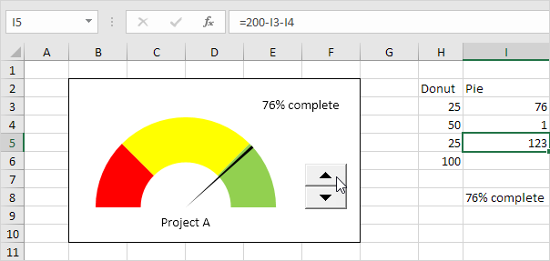
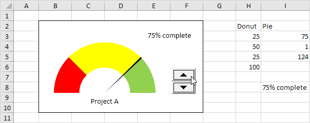
This is what the spreadsheet looks like.

 To create a gauge chart, execute the following steps.

1. Select the range H2:I6.

Note: the Donut series has 4 data points and the Pie series has 3 data points.

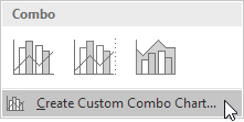
2. On the Insert tab, in the Charts group, click the Combo symbol.

3. Click Create Custom Combo Chart.

The Insert Chart dialog box appears.

4. For the Donut series, choose Doughnut (fourth option under Pie) as the chart type.

5. For the Pie series, choose Pie as the chart type.

6. Plot the Pie series on the secondary axis.
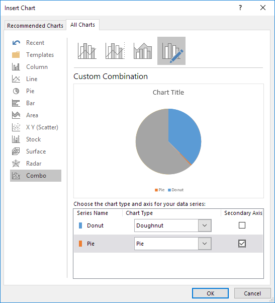
7. Click OK.

8. Remove the chart title and the legend.

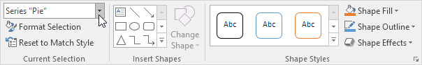
9. Select the chart. On the Format tab, in the Current Selection group, select the Pie series.

10. On the Format tab, in the Current Selection group, click Format Selection and change the angle of the first slice to 270 degrees.

11. Use the ← and → keys to select a single data point. On the Format tab, in the Shape Styles group, change the Shape Fill of each point. Point 1 = No Fill, point 2 = black and point 3 = No Fill.

Result:

Explanation: the Pie chart is nothing more than a transparent slice of 75 points, a black slice of 1 point (the needle) and a transparent slice of 124 points.

12. Repeat steps 9 to 11 for the Donut series. Point 1 = red, point 2 = yellow, point 3 = green and point 4 = No Fill.

Result:

13. Select the chart. On the Format tab, in the Current Selection group, select the Chart Area. In the Shape Styles group, change the Shape Fill to No fill and the Shape Outline to No Outline.

14. Use the Spin Button to change the value in cell I3 from 75 to 76. The Pie chart changes to a transparent slice of 76 points, a black slice of 1 point (the needle), and a transparent slice of 200 – 1 – 76 = 123 points. The formula in cell I5 ensures that the 3 slices sum up to 200 points.

Post navigation

Previous Post:

VLOOKUP without #N/A error in Excel

Next Post:

Manipulating text strings using Left, Mid, Right, Len, Substitute in Excel

Leave a Reply Cancel reply

Your email address will not be published. Required fields are marked *

Learn Basic Excel

Ribbon
Workbook
Worksheets
Format Cells
Find & Select
Sort & Filter
Templates
Print
Share
Protect
Keyboard Shortcuts

Categories

  • Charts
  • Data Analysis
  • Data Validation
  • Excel Functions
    • Cube Functions
    • Database Functions
    • Date and Time Functions
    • Engineering Functions
    • Financial Functions
    • Information Functions
    • Logical Functions
    • Lookup and Reference Functions
    • Math and Trig Functions
    • Statistical Functions
    • Text Functions
    • Web Functions
  • Excel VBA
  • Excel Video Tutorials
  • Formatting
  • Grouping
  • Others

Logical Functions

  • How to use Excel OR Function
  • IF, AND, OR and NOT Functions Examples in Excel
  • OR function Examples in Excel
  • IF with wildcards in Excel
  • How to use Excel TRUE Function

Date Time

  • Roll back weekday to Friday base on a particular date in Excel
  • Add business days to date in Excel
  • SECOND function: Description, Usage, Syntax, Examples and Explanation
  • Get days, months, and years between dates in Excel
  • HOUR function: Description, Usage, Syntax, Examples and Explanation

Grouping

  • Categorize text with keywords in Excel
  • Running count group by n size in Excel
  • How to randomly assign data to groups in Excel
  • If cell contains one of many things in Excel
  • Group numbers with VLOOKUP in Excel

General

  • Mark Workbook as Final in Excel
  • Count cells less than in Excel
  • Basic error trapping example in Excel
  • Find, Select, Replace and Go To Special in Excel
  • Transpose: Switch ‘Rows to Columns’ or ‘Columns to Rows’ in Excel
© 2026 xlsoffice . All Right Reserved. | Teal Smiles | Abbreviations And Their Meaning