Skip to content
Free Excel Tutorials
  • Home
  • Excel For Beginners
  • Excel Intermediate
  • Advanced Excel For Experts

Data Analysis

  • Calculate Conditional Percentile ‘IF’ in table in Excel
  • Working With Tables in Excel
  • How To Load Analysis ToolPak in Excel
  • Get column name from index in Excel Table
  • How To Sort One Column or Multiple Columns in Excel

References

  • Basic INDEX MATCH approximate in Excel
  • Two-way lookup with VLOOKUP in Excel
  • How to get first column number in range in Excel
  • Lookup entire row in Excel
  • CHOOSE function: Description, Usage, Syntax, Examples and Explanation

Data Validations

  • Excel Data validation require unique number
  • Excel Data validation number multiple 100
  • Excel Data validation must not contain
  • Data validation must not exist in list
  • Excel Data validation must contain specific text

How To Create Frequency Distribution in Excel

by

Did you know that you can use pivot tables to easily create a frequency distribution in Excel? You can also use the Analysis Toolpak to create a histogram.

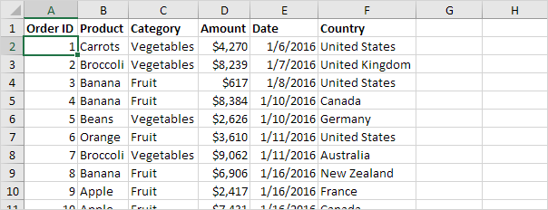
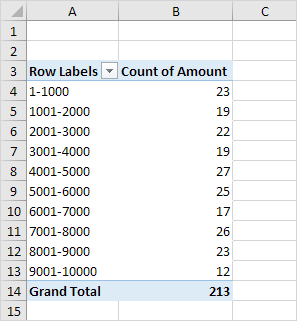
Remember, our data set consists of 213 records and 6 fields. Order ID, Product, Category, Amount, Date and Country.

First, insert a pivot table. Next, drag the following fields to the different areas.

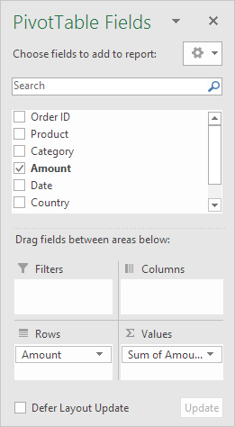
1. Amount field to the Rows area.

2. Amount field (or any other field) to the Values area.

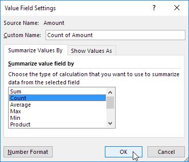
3. Click any cell inside the Sum of Amount column.

4. Right click and click on Value Field Settings.

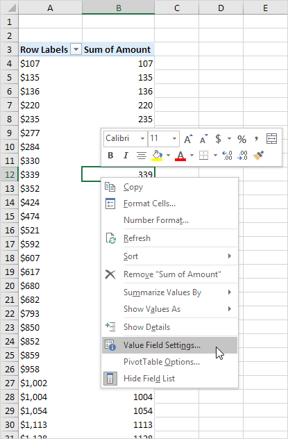
5. Choose Count and click OK.

6. Next, click any cell inside the column with Row Labels.

7. Right click and click on Group.

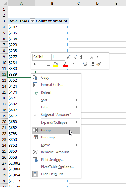
8. Enter 1 for Starting at, 10000 for Ending at, and 1000 for By.

9. Click OK.

Result:

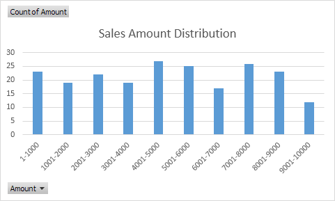
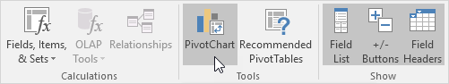
To easily compare these numbers, create a pivot chart.

10. Click any cell inside the pivot table.

11. On the Analyze tab, in the Tools group, click PivotChart.

The Insert Chart dialog box appears.

12. Click OK.

Result:

Post navigation

Previous Post:

TRUE function: Description, Usage, Syntax, Examples and Explanation

Next Post:

Excel Pie Chart

Leave a Reply Cancel reply

Your email address will not be published. Required fields are marked *

Learn Basic Excel

Ribbon
Workbook
Worksheets
Format Cells
Find & Select
Sort & Filter
Templates
Print
Share
Protect
Keyboard Shortcuts

Categories

  • Charts
  • Data Analysis
  • Data Validation
  • Excel Functions
    • Cube Functions
    • Database Functions
    • Date and Time Functions
    • Engineering Functions
    • Financial Functions
    • Information Functions
    • Logical Functions
    • Lookup and Reference Functions
    • Math and Trig Functions
    • Statistical Functions
    • Text Functions
    • Web Functions
  • Excel VBA
  • Excel Video Tutorials
  • Formatting
  • Grouping
  • Others

Logical Functions

  • IFNA function: Description, Usage, Syntax, Examples and Explanation
  • How to use Excel XOR Function
  • Not Equal To ‘<>‘ operator in Excel
  • How to use Excel TRUE Function
  • IF function: Description, Usage, Syntax, Examples and Explanation

Date Time

  • How to get same date next month or previous month in Excel
  • Get days, hours, and minutes between dates in Excel
  • Add days exclude certain days of week in Excel
  • Sum race time splits in Excel
  • Extract date from a date and time in Excel

Grouping

  • Group times into unequal buckets in Excel
  • Map inputs to arbitrary values in Excel
  • Calculate conditional mode with criteria in Excel
  • Group numbers with VLOOKUP in Excel
  • If cell contains one of many things in Excel

General

  • How to calculate percent change in Excel
  • Basic error trapping example in Excel
  • Index and match on multiple columns in Excel
  • Advanced Number Formats in Excel
  • How to calculate total from percentage in Excel
© 2026 xlsoffice . All Right Reserved. | Teal Smiles | Abbreviations And Their Meaning